Blog
Oregon Ducks Unveil New “Heroes” Generation O Uniform
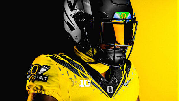
The Oregon Ducks have introduced their fourth “Generation O” uniform for the 2024 season, marking a rare Sunday release following a leak on Friday. While the timing may seem coincidental, this striking yellow and black ensemble is dubbed the “Heroes” uniform, honoring those who have fought or are currently battling cancer and raising awareness for the cause.

At first glance, the uniform may evoke a retro feel, but it features many subtle—and a few prominent—details inspired by Head Coach Dan Lanning, his wife, and their three sons. Lanning’s wife, Sauphia, is a bone cancer survivor who completed her treatment in 2017. Elements of the uniform are thoughtfully designed to reflect her journey and that of her family.
Before diving into the uniform details, I encourage you to watch the accompanying hype video. It’s not only heartwarming but also highlights the personal significance behind the Lannings’ designs.
Now, let’s examine the uniform.
The jersey is primarily yellow and incorporates various throwback elements from past Ducks uniforms. The black feather design features hints of gray and anthracite, complemented by a silver diamondplate pattern beneath the wings. The yellow base color symbolizes Sauphia’s fight against osteosarcoma, while the helmet, cleats, gloves, and sleeve patches showcase a vibrant panel honoring all cancer victims. The numbers are rendered in Oregon’s custom font in black.
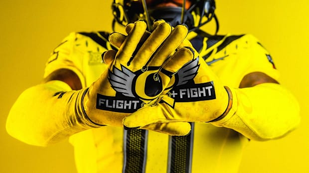
Prominently displayed on the right sleeve is a “FLIGHT + FIGHT” logo patch, which incorporates Sauphia’s ribbon concept, inspired by the Lannings’ middle son, Kniles. This patch also features silver wings flanking the “O” logo.
According to the team, “Sauphia’s original sketch of the ‘O’ with a ribbon included the phrase ‘Take Flight + Fight.’ She chose the plus sign instead of ‘and’ or an ampersand to mirror the sign of the cross, an international symbol for healthcare providers.” One sleeve boasts the “Flight + Fight” patch, while the other features “Stomp Out Cancer” beneath the image of a bell, which cancer survivors ring to signify the end of their treatment.
The opposite sleeve mirrors this design, showcasing a yellow bell with the words “STOMP OUT CANCER” underneath.
The “FLIGHT + FIGHT” logo also appears on the gloves.

In a creative touch, the Lanning’s eldest son, Caden, suggested including an ice cream cone in the design. This playful element, along with the formula for one of the chemotherapy drugs Sauphia received, is featured on the players’ compression sleeves.
“This is her love letter to her heroes, which is why we wanted to call it ‘Heroes,’” said Quinn Van Horne, senior designer for Van Horne Brands, the team behind the Lannings’ uniform concepts. “This is her way of thanking the people who truly helped save her life.”
Follow Our Social Media: Facebook, Twitter, Instagram, Pinterest
HOMEPAGE: BEEBEOS.COM
 Skip to content

